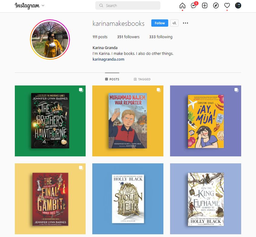
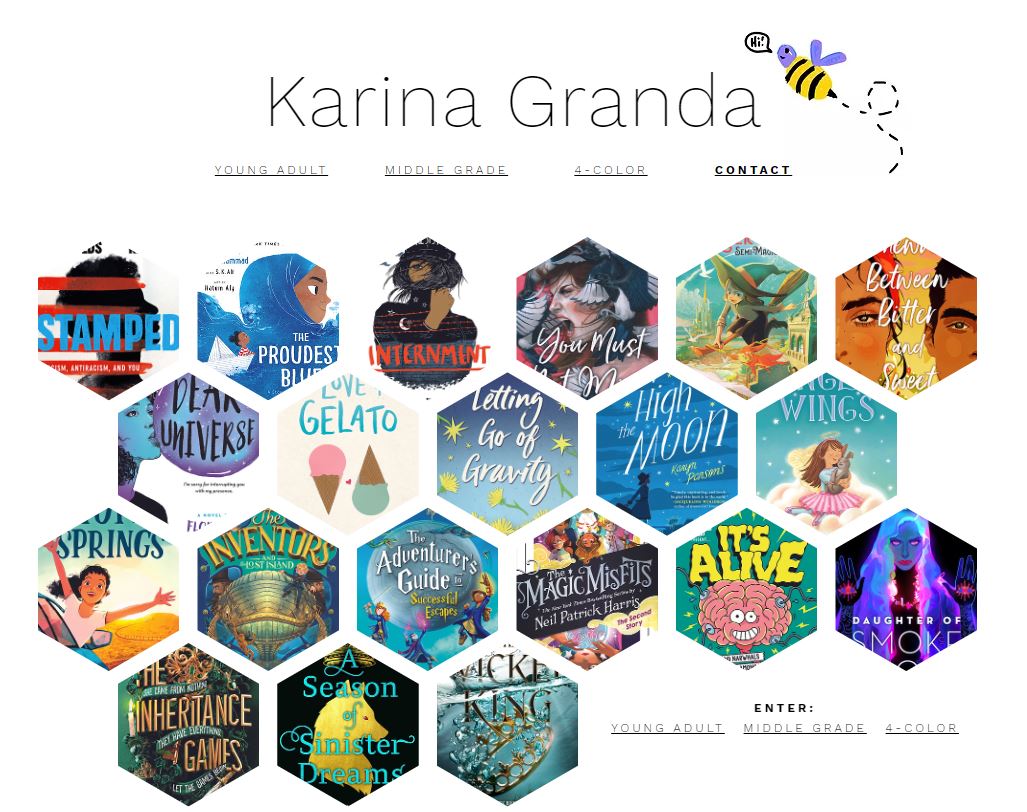
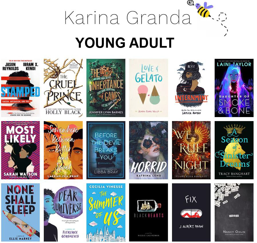
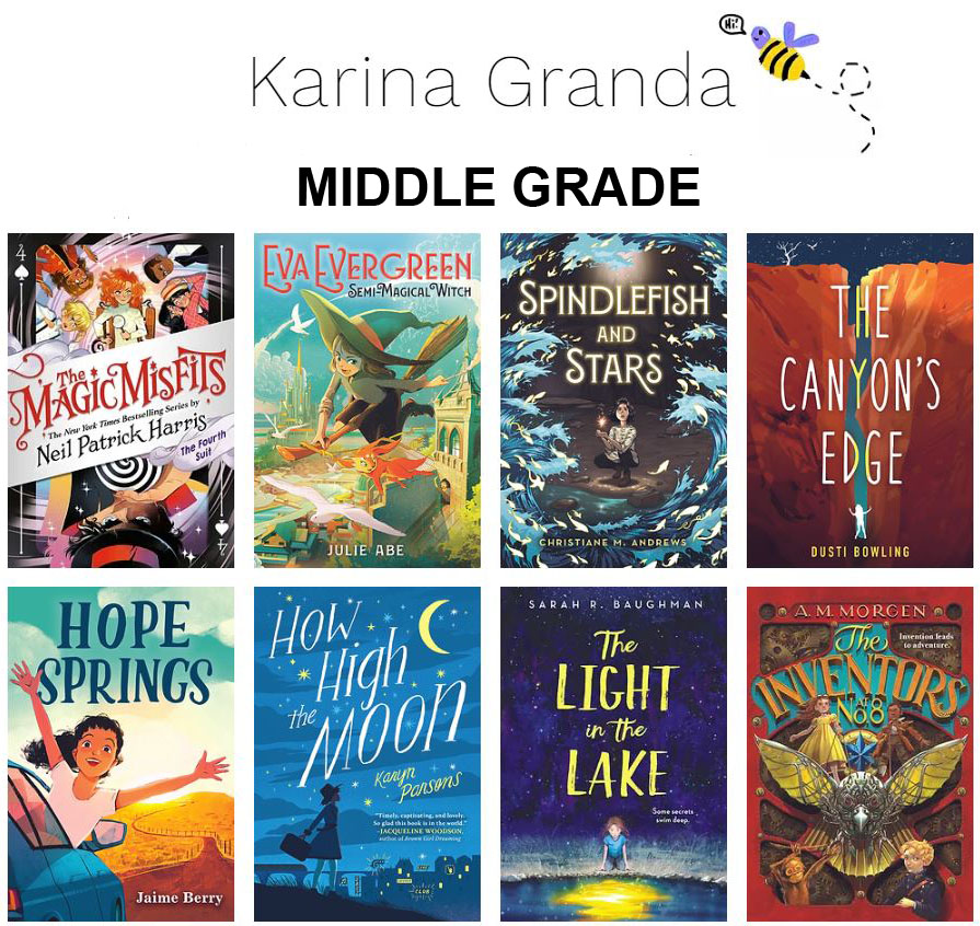
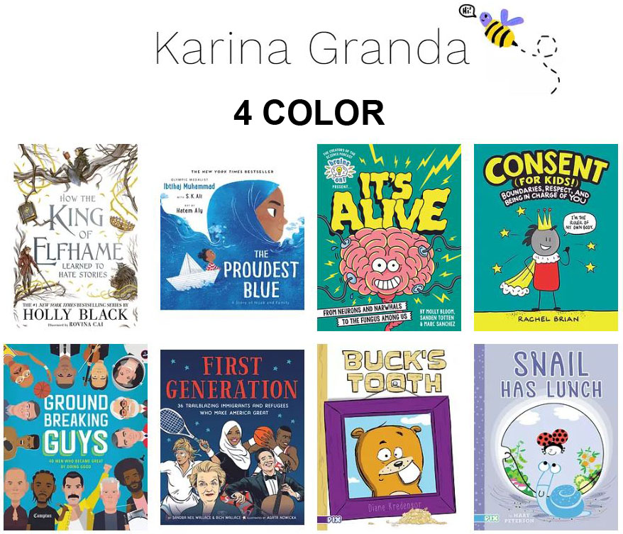
Our fifth Illustration West 61 interview is with Karina Granda, Art Director at Little, Brown Books for Young Readers. She has designed and art directed many award-winning and bestselling books including The Proudest Blue, The Magic Misfits series, Stamped and Stamped (for Kids), The Inheritance Games series, the Folks of the Air series, Internment, and the Love & Gelato series. When not reading or making books, she loves hunting for the best cheese and donuts, taking long walks (city or nature!), wandering through museums, and watching reality TV.
Board member Joe Cepeda, President, conducted the interview with Karina.
What can you share about your road to your position as art director at LBYR?
I have always been a lover of art and books. So the fact that it never occurred to me in my youth that I could be a maker of books is really amazing to me! But I would say that overall the school system poses a rather limited view on your career options, and the artist is most often someone with a canvas and paintbrush—struggling or wealthy. Haha! And though being a painter was appealing, realistically I was not super talented in that skillset. That said, I still pursued more “general” art programs and also liberal arts programs for college. I ended up at the Gallatin School at NYU which is fully independent study, which was good for me because it allowed me to continue to explore my options without settling for “forget it, I’ll just become a lawyer.”
I took a lot of studio art classes, art theory, magazine making etc; and thought I would one day work for an art magazine or a museum. I was always very driven and pursued jobs and internships early—worked at Cabinet Magazine and the Whitney Museum and Printed Matter. And though I had some lovely experiences (well, except at the Whitney—it was too snobby for me), nothing quite “fit.”
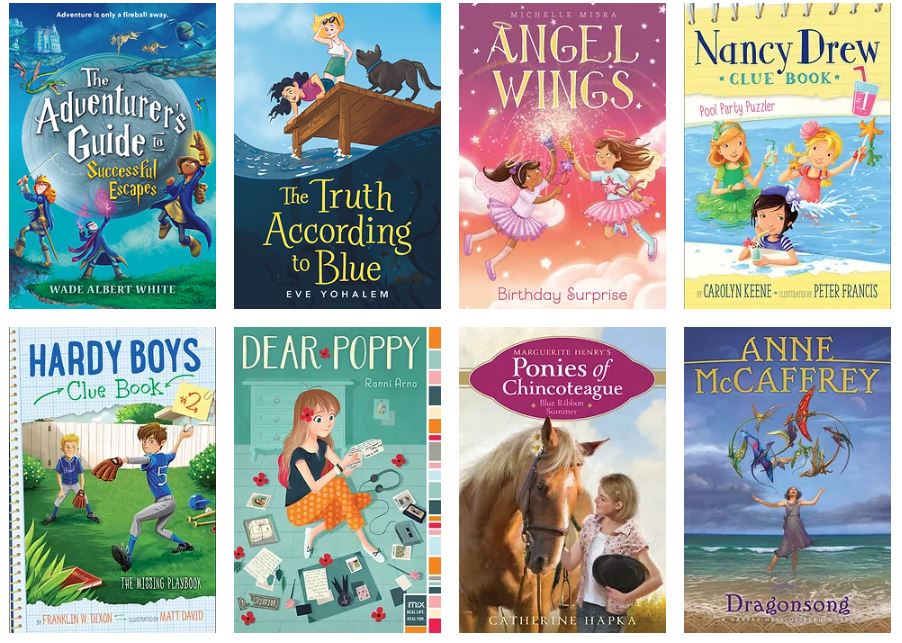
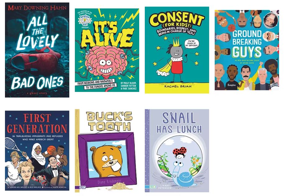
For context, this was also all around 2009-2010 when the economy was crashing, print was going to be dead, and online video was the next frontier. I was desperate to give my parents a reason why I HAD TO stay in NYC for the summer, so I went to the NYU job fair with the mindset of “I’ll take ANYTHING.” An HR representative from Simon & Schuster latched on to that I’d had a brief stint doing videos for Time Out Magazine—which is how you know NO ONE knew what they were doing at the time since I had practically no prior video experience and was teaching myself along the way. The issue was that I absolutely hated it. S&S offered me an internship for video work, and I must have been feeling bold that day because I asked, Do you have anything else? And she said, only in Children’s Design. And I said, I’ll take it! And really the rest was history. It focused me on being a designer and art director (which are my actual talents, more so than painting and drawing), it was an art immersive career, and I found my people.
I grew from an intern to Junior Designer and then a Designer at S&S, but eventually there was just no room for me there since it was so top-heavy; and it is good to see what it is like in other places; so I moved over to LBYR as a Senior Designer. And I have loved it. It’s just big enough to have the support and resources I need, but small enough to still have a very art- and passion-driven approach to books. I could not be happier.

What influences your particular design aesthetic?
Bold, graphic, pop of color, iconic. I love nothing more than a striking central image and an interesting palette. I also like a visual twist—an unexpected element, an image than can be viewed two different ways, or when there is a hidden object or message. Movie posters, pop art, advertisement.
For our members, and illustrators looking to get work in children’s publishing, what draws your eye?
There is no “formula” for this but here are some things that I gravitate towards over and over again:
1- a youthful palette (nothing too brown, always some pop of color)
2- characters that are attractive to and the right age group for our markets (whether it be kids or young adults)
3- expressive faces in a range of emotions
4- BIPOC representation
5- bold/central/iconic images (people or objects)
6- illustrators that keep the design in mind—Can I realistically put type on this?
Where and how do you find illustrators?
The real answer is EVERYWHERE! Agencies are an obvious and great place to start especially for projects that are a rush. It allows me to consider a bunch of artists/styles at once, and agents can be very helpful in speeding along negotiation, schedules, and feedback. Though I will note that I much prefer working with illustration agencies rather than literary agencies since the contracts for Novels art (my primary job) differs very much from those in Picture Books, so it always feels like I am a little bit more on the same page with agencies whose primary focus is illustration rights.
But I am a visual enthusiast, and when I see something I like out in the world, I make it my mission to track down the artist and add them to my bookmarks. Social media (particularly Instagram) is a great place for this. I follow artists and other art directors that I like, and then I dig in to see which artists they are following too. I have also been known to find artists on MTA (NYC subway) advertisements, graphics at the stationary shop, packaging at the grocery store, looking at other books at the bookstore, etc.
Finally, many artists will email me links to their portfolios; and while I simply do not have time to respond to everyone (and therefore, out of a duty to fairness, do not respond to anyone ), I do always look at their portfolios, and if I consider it to have potential for our books, I save it to my bookmarks as well.
All artwork ©2022 for all artists’ work reviewed and not for re-use without permission of any of the artists.
