Our seventh Illustration West 61 interview is with Rick Sealock. Board member Jon Messer, Secretary and Program Chair, conducted the interview with Rick.
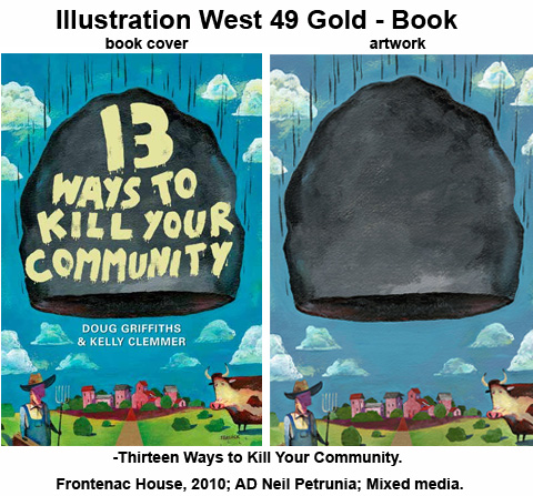
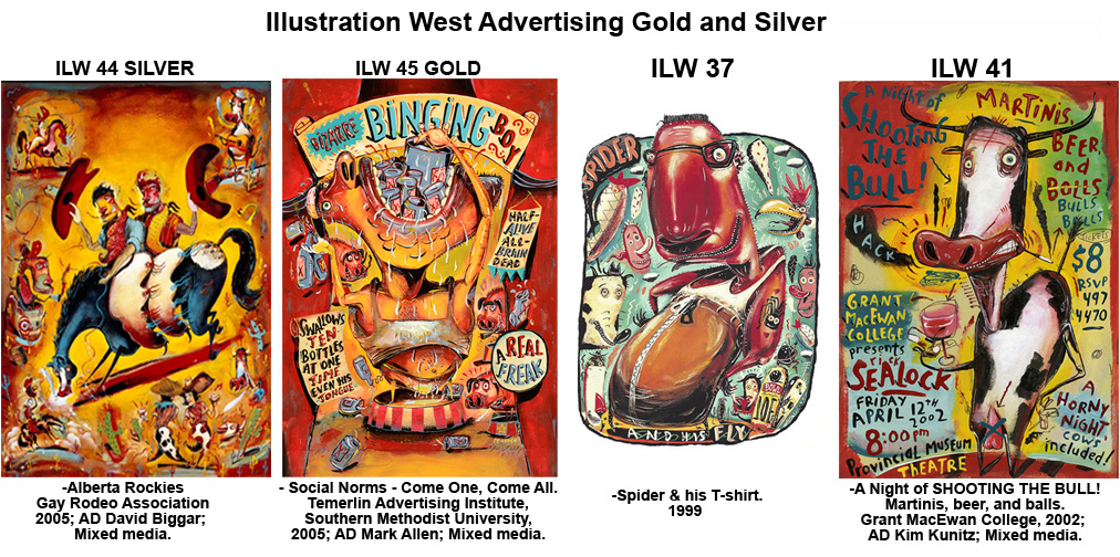
What inspired you to become an illustrator?
In hindsight, I blame it on the comics of the day, mostly Mad magazine and Cracked. I grew up with these visual brain-bashing encyclopedias of Life and loved their imaginative and sarcastic natures. Caricature and editorializing were a main focus beyond the pure entertainment value. They made Commentary an artform. Political, Social Realism, and Narrative art, to name a few, also dealt with the same issues and humanist concepts…but maybe not as Mad. When I attended the Alberta College of Art (later ACAD and now AU Arts) I was introduced to the works of Picasso, Matisse, Beckmann, Kirchner, Hockney, Dix, and Grosz – loved this man’s art. There were Impressionist, Expressionist, Pop Art artists and more, and they all influenced my color and drawing approach. It seemed only natural for me to explore and develop images with hopefully a distorted, manic, and sarcastic approach. See the work, see the man…or as homage to Mad, monkey do as monkey see!
Where did you grow up and did that have an influence on your artwork?
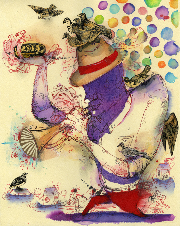 I was raised under the tall skies and wide-open prairies of Southern Alberta. Yes, a Canada-boy. Although we did not have the luxury of electricity or running water until I was fifteen, we did have an antelope as our pet dog named Charlie. Many hours were spent sitting in the bunkhouse reading westerns, drawing wild west scenes by studying Charles M Russell and Frederic Remington prints and calendars as inspiration. Copying comic book or Mad Magazine covers and characters, and any other comics we could get our hands on. At night we crowded around the kitchen table, lit by the one kerosene light, enjoying tall tales of the Wild West and olden days. Storytelling was part of my heritage, on the prairies it opened worlds, a pastime that intuitively set me on the path to illustration.
What genre of illustration holds your imagination, and can you say why?
I love Editorial illustration! I love the rush, the deadlines, the unknown, it’s where I live! Though I still enjoy a weekend visit to Advertising and Publishing.
In college, we were taught to be realistic and technical illustrators but there were others who loved and commanded the technique better than I. So, if you can’t beat them, then outthink them, and always be different. I became a conceptual illustrator who interprets commentary within a personal stylistic approach for clients, mostly magazines and newspapers. Whether it’s an Op-ed article, a music review, or a portrait; the more biting the better. For the past decade (or more) I have concentrated on creating portraits, an undertaking that falls into the category of love/hate. I love the challenge of capturing the vital physical features of a subject and his/her cultural meaning. And I hate when it does not happen. Yet while my portraits have garnered recognition, I know I stand on the shoulders of giants like Barry Blitt, Steve Brodner, Alan E.Cober, Sue Coe, Blair Drawson, Rubem Campos Grilo, Francis Jetter, Anita Kunz, Geoffrey Moss, Ian Pollock, Gerald Scarfe, and Ralph Steadman (to name only a few) who continually inspire my work and teaching.
Is there a cultural component to your love of illustration?
 To be a storyteller, a communicator, and to have fun!
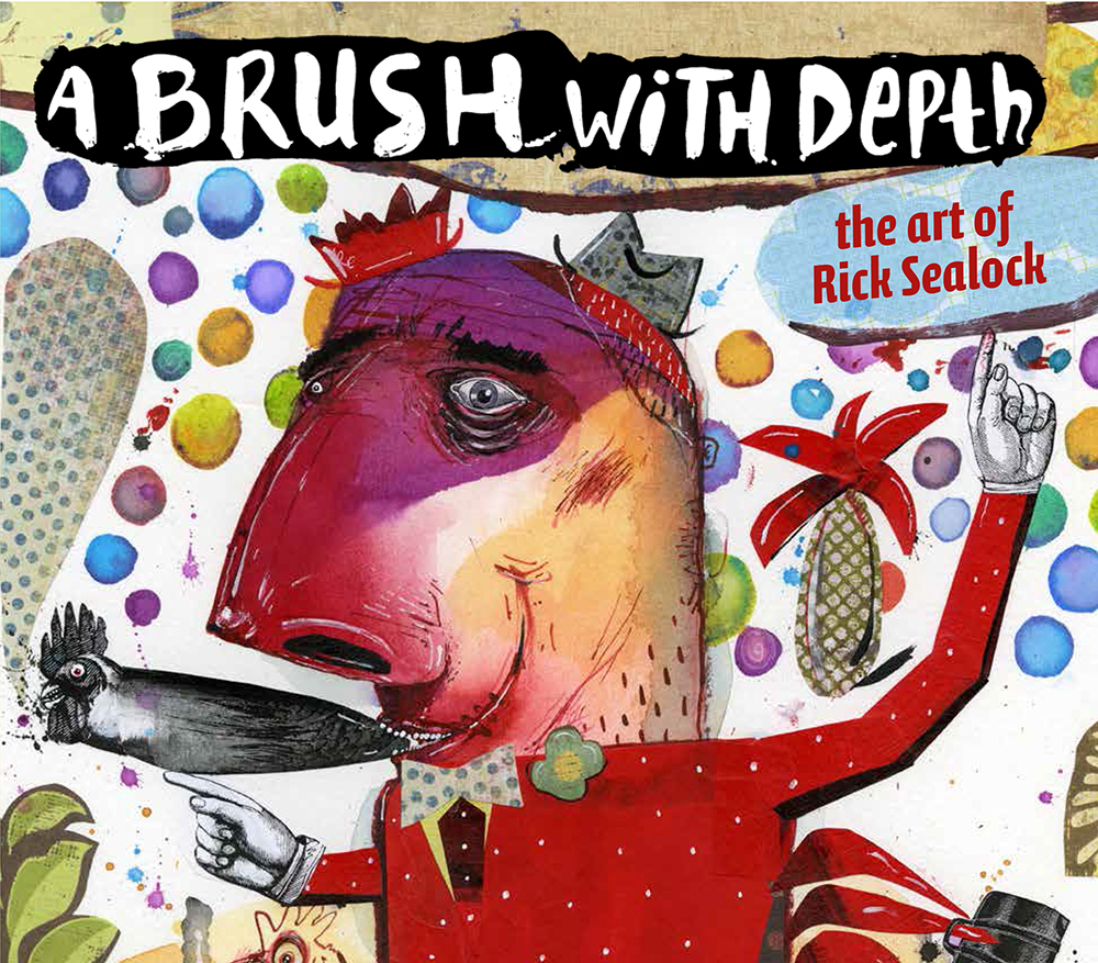
After a 30 plus years of freelance illustrating and teaching illustration I view my book as a cultural component, and at the best, a contribution that conveys my love of illustration.
When lecturing I would borrow experiences from freelance commissions, attempting to educate the complexities …and craziness of a ever changing illustration industry to my students. Later I thought it would be fun to embrace a user-friendly technology to share my lectures, experiences, horror stories a’ la a book format. While my images are the main focus (channelling a coffee table as big as a picture book or vice versa) it was vitally important to advocate the discipline, resilience, and curiosity required to sustain a career in our industry. And yes, always the shameless self-promoter!
Where did you get your training?
 I never really considered illustration as a vocation until attending a year at University of Calgary. After failing a bit of everything or withdrawing from a few other forgetful classes, I discovered that I only enjoyed Art courses (the ones I passed). After a year I applied to the ACA’s Visual Communications program, intent on being a graphic designer. I quickly learned that this was way too much like real work! I had to be the Master of Letraset, the Ruler, French curves, talking to obnoxious clients, press checks at ungodly hours, or counting spaces between type, something called Kerning? By chance I wandered into the Visual Communication Illustration show, and I was hooked – commercial artist it was.
Do you feel the fundamental skills are still important in professional illustration?
Immensely important, they instil the discipline, confidence, and dedication to continually hone one’s visual and conceptual expectations. And you get to draw too! While there is constant shifting in our industry due to today’s technology, the passion and curiosity to explore and challenge one’s visual journey is still prevailing. And still intoxicating, thrilling, and scary, if the illustrator is willing to throw themselves onto their own pen. Essentially take chances and create an image that they believe in and put it out in the world, then the response to the image will help educate the illustrator. One develops better ideas and concepts through the work they produce, we learn as we create, we build upon each previous image to do better.
When did you get your first paying commission?
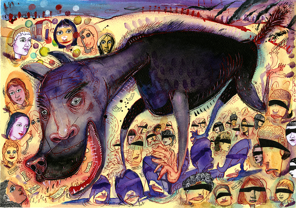
It was during my fourth year at ACA when I received my first big break, an editorial assignment called “Keep Moving” from Zoot Capri, a magazine published for teens by the Alberta Alcohol and Drug Commission. The art director, Ken Wentz, an ACA alumnus, visited the department to review portfolios of edgier styles that would be hip with the kids. Ken thought my student portfolio was interesting, but it was my sketchbook that blew him away. This sealed the deal on my first gig. I was over the moon, ecstatic, and scared all at the same time. Feeling about ten feet tall when delivering the final art to the magazine’s office, I was thinking this is the best illustration EVER! Ken was busy working but handed over a purchase order for my invoice. “What the heck is a PO?” I said, “and what the heck is an invoice?” Ken started laughing – a lot, and for a long time too. Now feeling about only a foot tall, I listened as he graciously showed me how other illustrators had written up invoices. Whew! … one down, 10,000 to go!
Was there a particular assignment that changed your trajectory? If so, how?
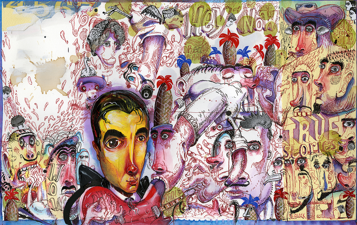
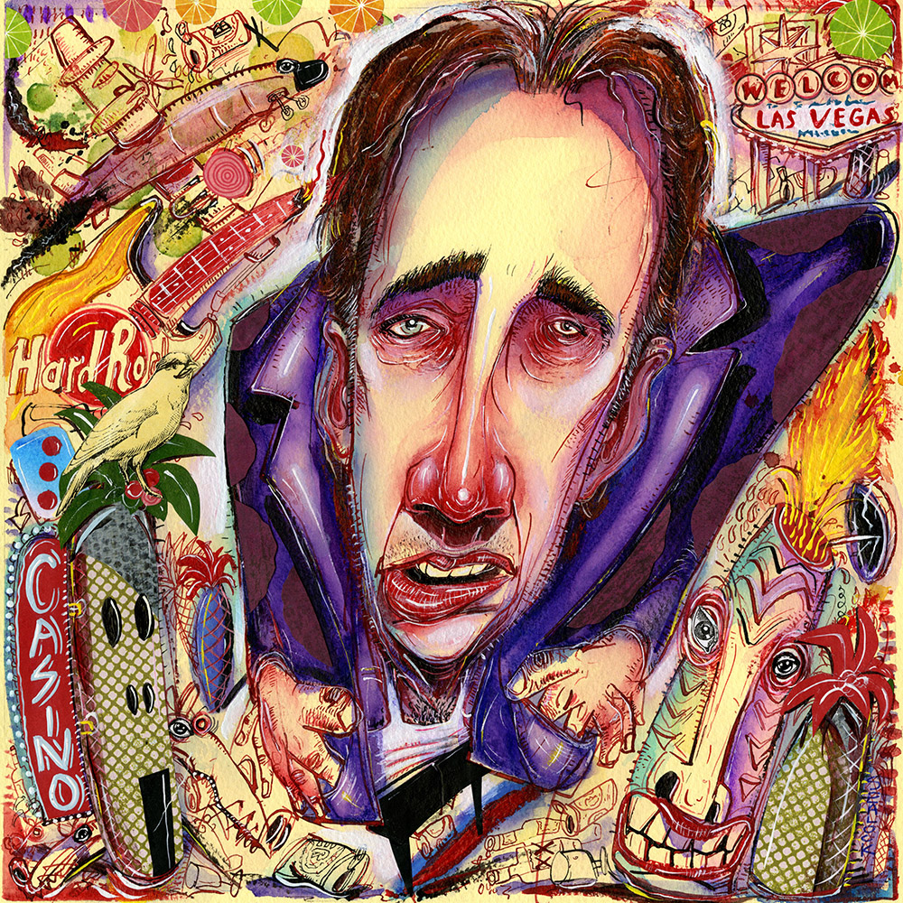
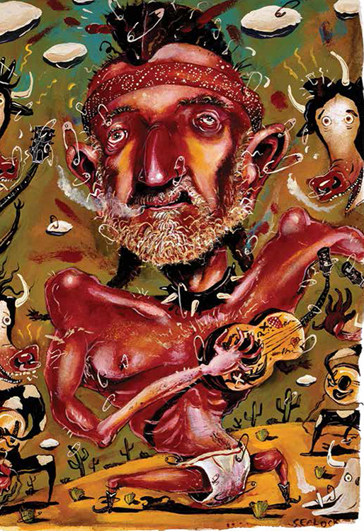 It was a magazine gig where the title “Never Mind the Bollocks, Here’s Willie Nelson” instantly summed up the visual direction of an image. By referencing both the Sex Pistols’ hugely influential album and Willie Nelson, the title meshed punk and country icons. It proved liberating as the intensity of this union gave me the freedom to bypass reference material, to sketch in the moment, and to develop the subjects’ look from reflection and memory. Piercings, pins and needles, diaper as dress mocking stage conventions, and the inelegant stance of the performer functioned as visual allusions to punk. Willie Nelson’s trademark braid, headband, and necktie, along with the ochre colours associated with western music, drew attention to the field of country.
It was a thrilling and terrifying job for several reasons. To paint a portrait of the great Willie Nelson was a dream – more so because it was for Texas Monthly magazine, another great in my opinion. Plus working with D.J. Stout was super cool too. It became a breakthrough piece as it firmly established my frenzied look and content approach. This work became a major self-promotional, it won awards and industry recognition, gained me follow-up work – an assignment that allowed me to paint Willie Nelson and Bob Dylan together), and freed me to Karaoke “On the Road Again”.
Can you share some highlights from your career?
Upon graduation I weighed the options of freelancing or being a studio-employed illustrator. I had, coincidentally, heard of a studio needing illustrators to create those itsy-bitsy ads for the Yellow Pages directory. My first job as a Studio Artist! On the first day I arrived early with dipping pens, pencils, and markers in hand eager to impress all and learn about the biz. The second day I was furnished with an exacto-knife, a technical pen, and a ruler to correct all my previous day’s mistakes. On the third day the studio owner suggested – no, insisted as he pointed at the front door – that I take time off to explore other illustrative pursuits. “Go for it,” he said, “right now. Don’t waste any more time!”
 What forms of media do you use and enjoy? Are there any that you avoid?
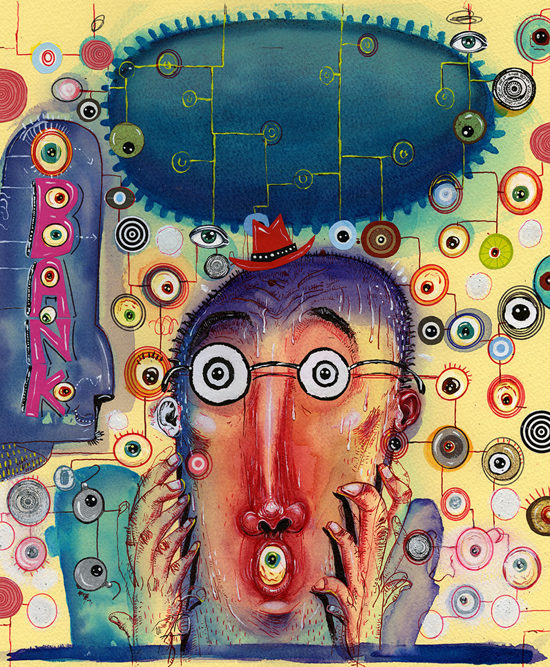
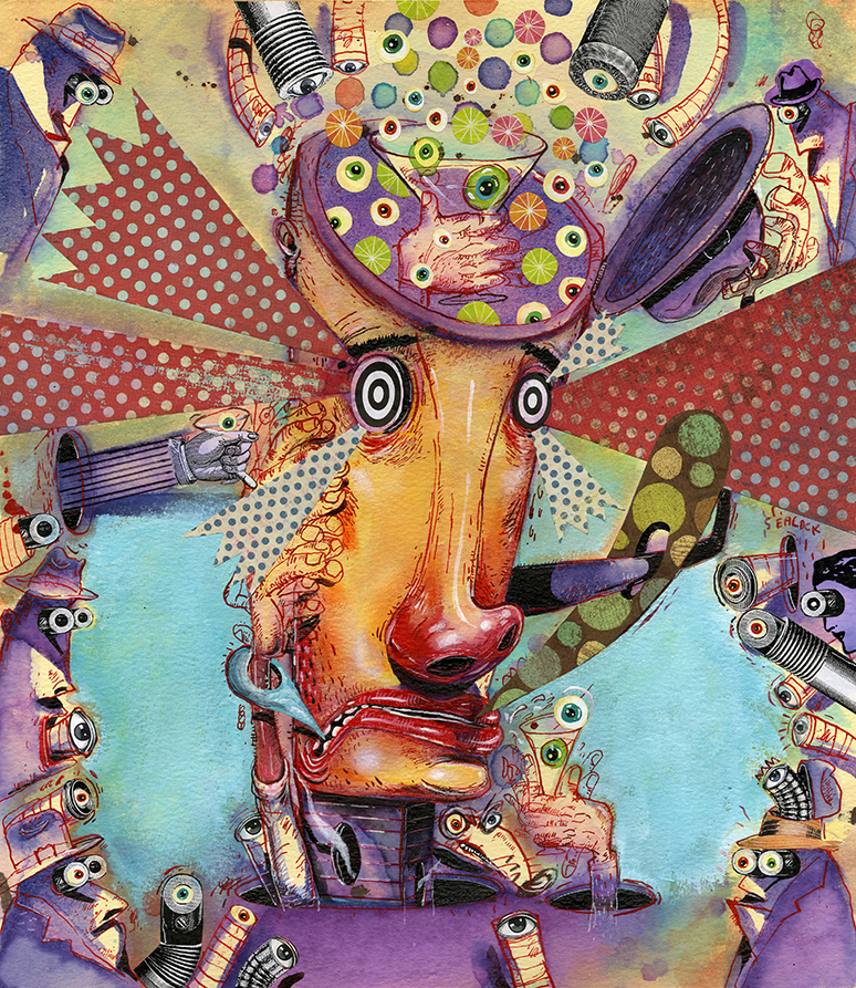 I’ve been thoroughly trained in the ancient technique of “whatever the Hell works to get the job done “. It’s basically an intoxicating martini of inks, watercolor, acrylics (both traditional tubes, jars, and cans of house paint), collage, pencils, pastels, prayer, self-flagellation …and a small pinch of love. And incredibly or sadly, from my college days I still use many of the original sable watercolor brushes, broken tubes of dried out hardened watercolors, thickened sludgy inks, and the Holy Grail of the lot – my Crow Quill Dip pens! Which still today are mightier than the sword.
It’s not that I avoid other media, it’s just that I’m still learning how to use and abuse my pen, inks, and watercolors. And secretly, there’s nothing more satisfying then discovering a magnificent watercolor paper to paint on.
Do you have career or training advice for artists?
(It may be quicker and easier to just read my book?)
1- Promote, Promote, Promote!
2 – Be passionate – for making, drawing, and seeing images. To illustrate is to kindle that bonfire of brilliance, that cauldron of creativity! Fire that sucker up, take chances, and stretch. Over many years I have striven to extend the visual parameters of my images, not just to demonstrate my conceptual and stylistic breadth, but also to unlock other visual avenues. Artistic stretching is not self-indulgence, it allows the production of illustrations that stray from the norm (hopefully) and recognition for this (hopefully). For me, images that cross personal and commercial requirements are often the most rewarding.
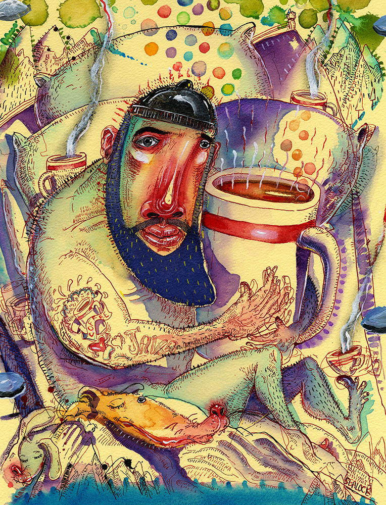 3 – Then Promote some more. Send out a postcard! Send out a painting! Hell, send both! Get ’em on social media, blogs, in group shows!
4 – Educate yourself. By this I don’t mean go and learn Latin – that’s a sine qua non. I mean go and read images – in books, games, graphic novels, movies, whatever. Look at peer-reviewed illustration annuals as they strive to showcase current excellent work. Know the history of art, illustration, and design. Inspire yourself by looking at those who came before you, whether they be illustrators, painters, animators, directors, photographers, any producers of visual work.
Enter many peer-juried competitions, participate in exhibitions at the various art directors’ clubs located around the country, and become a member too.
5 – Live in the past. No one on earth has the exact same memories, experiences, or background as you. Draw upon this so that your work is original and personal. Create images based on your personality and manner of thinking so that they’re different from those of others. Hone your history as you would your craft.
6 – Get a groove on. By this I mean an illustrator needs to create their own process strategy. I create better ideas when under the gun. I’ll be doing something else and boom! The concept flashes and the final is glimpsed. Then I draw like a demon, letting the deadline be my muse. Others say they think up great ideas just before falling asleep, exercising, reading, or just doodling. Avoid playing it safe. It will destroy your soul. It might also kill your career and death lasts a long time so put your best work out there.
7 – Promote even more. With perseverance, a heap of promos – and a bit of luck, talented and creative folks, amazing art directors, and daring designers will throw you some awesome assignments.
8 – Meet the mark. Work hard. Have fun. Good illustrators meet – or beat – their deadlines. On your mark!
Do you create in other forms of art?
Dance, but that should never be seen, reproduced, or even discussed.
If not teaching or illustrating, I find refuge in my sketchbooks.
Usually my sketchbooks are less directed, more spontaneous – definitely more fun! No matter the tone, sketchbooks invite illustrators to develop their best and most original concepts. They allow for the expression of opinion and feeling, and for the remolding and redirection of belief and norms; ultimately, they both broaden and hone an artist’s visual expression. They are the home of unfettered engagement with different aspects of one’s culture.
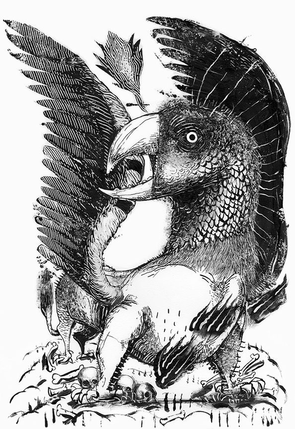
All artwork ©2022 Rick Sealock, not for re-use without permission of the artist.
